
Appearance
Image ratios and cropping
Product photos rarely arrive in one shape. Wonpa fits them to a uniform frame at display time, so a catalog shot in mixed portrait and landscape still lines up on the grid — you don't need to resize files before uploading.
There are two ratio controls, one for cards and one for the product gallery. They handle a mismatched image differently: cards crop to fill the frame, the product gallery letterboxes inside it.
Product cards
- Open Theme settings → Product cards.
- Set Image ratio. Square keeps grids tightest; Portrait suits apparel; Landscape gives a wider frame that suits flat-lay shots.
Cards crop: the image is scaled to fill the frame and whatever falls outside it is trimmed, so keep the product near the center of the photo.
This applies wherever cards render: collections, search results, featured collections, and recommendations.
Product page gallery
- In the theme editor, open a product page and select the Product section.
- Set Image ratio to Square, Portrait, or Landscape.
This setting sits under the Padding header in the Product section's list, below the two padding sliders.
The gallery does not crop. It sizes the stage to the chosen ratio, then fits the whole image inside it, centered. An image that doesn't match the ratio is letterboxed against the neutral surface color rather than trimmed or stretched, so nothing on a product photo is ever lost.
The square thumbnail strip beside the stage does crop, so thumbnails stay a uniform grid whatever ratio you pick.
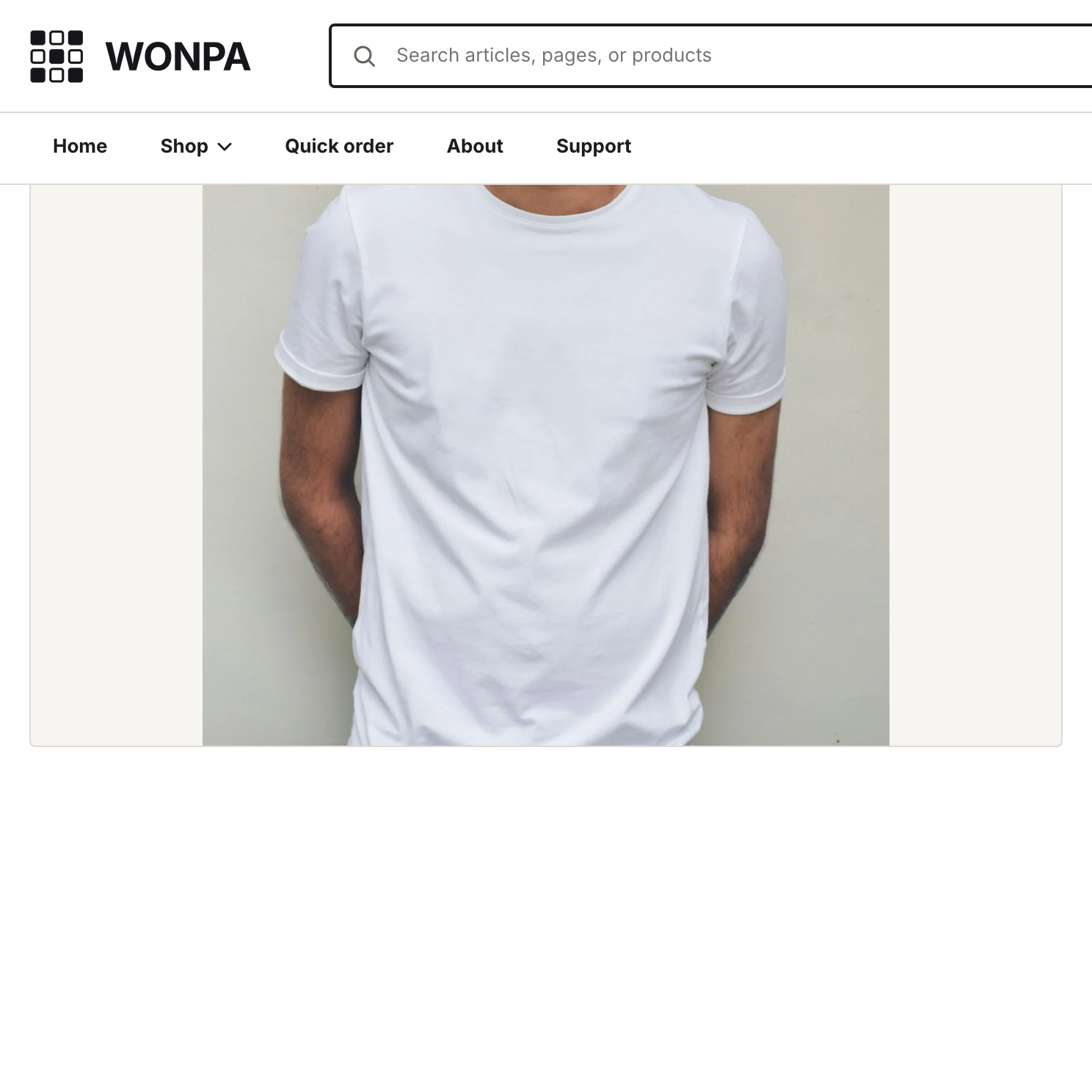
Zoom and the fullscreen lightbox show the full image too.
Note
Because the stage fits rather than crops, mixed-shape product photos leave visible empty space around the smaller ones. Shooting or exporting your product images at one ratio is still worth doing; the setting keeps the layout tidy, not the photos consistent.
Corner rounding
Corner style is global, not per-image. Theme settings → Layout → Corner style offers four levels — Sharp, Standard, Soft, Round — and applies to images, cards, buttons, and inputs together so the storefront stays consistent.