
Appearance
Rebuild the demo homepage
The demo homepage you see in previews is a stack of native Wonpa sections. There is no custom code and no page-builder app — every band is a section you can add yourself from Add section. This page lists the demo homepage in order so you can reproduce the look with your own products.
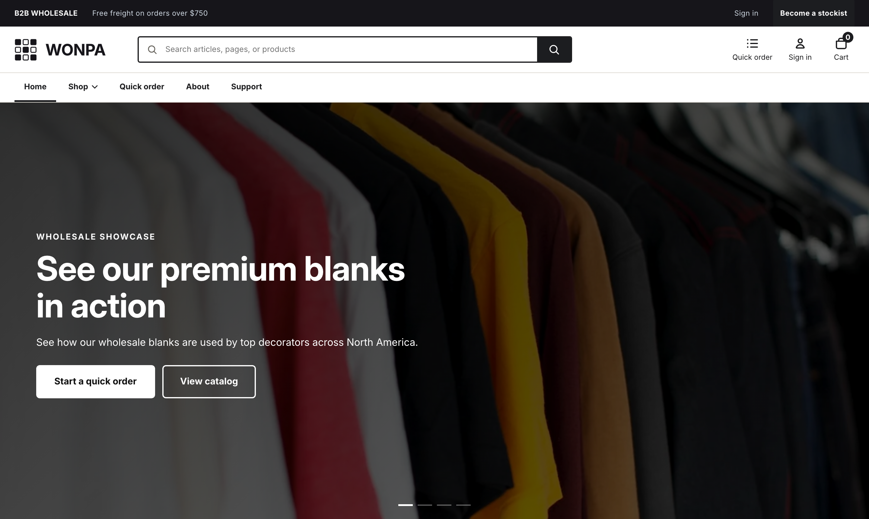
The shipped homepage template points at demo images and collections that don't exist in a new store. So the tiles and featured collection look empty until you swap in your own. Rebuilding the demo means keeping these sections and pointing their content at your catalog.
The demo homepage, top to bottom
1. Hero dynamic carousel
A full-bleed slideshow. The section ships with two placeholder slides; the demo uses four. Section settings control Transition style (Parallax slide or Smooth fade), Enable autoplay, Autoplay interval, Show navigation arrows, and Show dot indicators.
Each Slide block sets a Desktop image (recommended 2880 × 1620px), an optional video, an Overlay darkness, a Text background style (None, Semi-transparent black, or Glassmorphism), a Text position among nine anchor points, and up to two buttons.
Note
A slide with a hosted Desktop video (hosted) file plays that; a Desktop video (YouTube or Vimeo) URL is next in line; the Desktop image is the fallback when neither is set.
2. Hero
A single static banner under the carousel. It carries an Eyebrow, a Heading that accepts inline HTML, Text, two buttons, a Background image, and a Height (Small, Medium, or Large). Delete the section if the carousel alone covers your homepage.
3. Trust strip
A thin row of four Item blocks. Each block picks an Icon — Box, Credit, Truck, or File — and sets a Heading and Text. The demo reads Case pricing, Net 30 terms, Ships in 24h, and Spec sheets on file. Up to six items fit.
4. Category tiles
A grid of collection shortcuts under a Heading and a "View all" link. Each Collection block points at one collection and picks an Icon — T-shirt, Hoodie, Jacket, Pants, Cap, Bag, Box, Bottle, Jar, or Bolt — shown when the collection has no image of its own. The demo has six tiles.
5. Featured collection
A product row. Set the Heading and Collection, then Products to show (2 to 12) and Columns (2, 3, or 4). The demo shows 8 products across 4 columns.
6. Quote request banner
A call to action pointing returning buyers at quick order. Set the Eyebrow, Heading, Text, and two buttons.
Note
This section only renders when Enable quote requests is on under Theme settings → Wholesale. With it off, the section stays hidden on the storefront even while it sits in the editor.
7. Testimonials
A logo wall plus pull quotes. Client blocks hold a name for the wall; Testimonial blocks hold a Quote, an Author, and a Company / role. The demo uses five clients and three quotes under one Heading.
8. Newsletter
An email signup with a Heading and Text. Submissions go to your Shopify customer list.
Rebuild it on your store
- On a fresh install, open the homepage in the theme editor and work down the list above.
- For Category tiles and Featured collection, replace the demo collections with your own.
- For the carousel, upload your images and rewrite the copy.
- To recolor the whole page at once, edit the four color schemes in Theme settings → Colors. Style and look lists three ready-made palettes you can type in.
The About page template
The homepage doesn't have room for every section, so Wonpa also ships an about page template that stacks five more: Image with text, Multicolumn, Logo list, Featured product, and Store info. It's the fastest way to see what those look like with content in them.
To use it, create or open a page under Online Store → Pages, then pick about under Theme template in the sidebar. Replace the demo copy — the addresses, hours, phone number, and account names in it are invented.
Note
A page keeps whichever template you assign, so this is a per-page choice, not a theme setting. Pages you leave on the default page template render just their own content.