
Appearance
Product page
The product page is built from blocks. Add, remove, and reorder them in the theme editor to match how your buyers shop — price and volume table near the top, terms and FAQ rows lower down.
Open a product in the theme editor and select the Product section. Everything below is a block inside it, except the four section-level settings.
Section settings
The section has four settings, all listed under the Padding header.
- Top padding sets the space above the section.
- Bottom padding sets the space below it.
- Image ratio sets the gallery crop — Square, Portrait, or Landscape. See Image ratios and cropping.
- Show only the selected variant's images hides other variants' photos when a variant is picked. See Variant-scoped galleries.
The blocks
Each block below has a fixed slot in the info column unless noted. Drag to reorder; delete any you don't need.
- Title — product title, an eyebrow line (vendor and first collection), and a meta row with style number, fabric, and color count. The Show vendor toggle controls whether the vendor appears in the eyebrow. The meta row hides itself when there's no data.
- Price — the wholesale pricebox: the price, the per-unit line, the volume pricing table, an MSRP and MOQ footer, and a tax note. See Volume pricing tiers and Login-gated pricing.
- MOQ badge — tags for minimum order quantity, increment, and maximum. Renders only when the variant's quantity rule sets one of them.
- Variant matrix — the order grid for two-option products, otherwise a variant picker. See Size matrix ordering. Its Low-stock badge threshold flags a cell when the variant has that many units left or fewer. Only variants that track inventory and stop selling when sold out are flagged, and only while stock is still above zero. The range is 0–200 units, default 24; 0 turns the badge off.
- Buy buttons — quantity stepper, add to cart, dynamic checkout, the request-a-quote link, and the assurance grid. Covered below.
- Description — the product description. Renders full-width below the two-column grid, since long copy reads badly in a narrow column.
- SKU & meta — a plain line with SKU, vendor, and product type.
- Customer reviews — the ratings summary and review cards, full-width below the grid. See Reviews and FAQ.
- Collapsible row — one expandable FAQ or terms row (Shipping, Care, Wholesale terms). Add one block per row. See Reviews and FAQ.
- Custom Liquid — your own Liquid or HTML in the info column.
- App blocks — blocks provided by apps you have installed. The section accepts them alongside the theme's own blocks.
Note
Three parts of the Price block are conditional. The volume pricing table needs Theme settings → Wholesale → Show volume pricing table turned on and a product with tiers. The MSRP line needs Theme settings → Product cards → Show MSRP and margin — that Product cards setting drives this product-page line too — plus a compare-at price above the selling price. The MOQ line needs a variant minimum above 1. When neither the MSRP nor the MOQ line applies, the footer is skipped entirely. The tax note always renders and repeats the cart's wording.
Buy buttons
The Buy buttons block holds the add-to-cart area.
- The quantity stepper reads the variant's Shopify quantity rule. Its minimum, maximum, and step come straight from that rule, and the maximum also caps at sellable stock minus what's already in the cart.
- Show dynamic checkout button turns the accelerated checkout button (Shop Pay and similar) on or off. It sits under add to cart.
- Request-a-quote link adds a ghost button below the buy area. It appears only when Theme settings → Wholesale → Enable quote requests is on and this URL is set.
- The assurance grid is the four-line strip at the bottom of the block — spec sheets, payment terms, shipping speed, and program quotes. It always renders and has no editor settings; the four lines are fixed in the theme's locale file.
Two-option products add to cart through the matrix instead, so the stepper and single-variant add-to-cart don't render for them. The matrix enforces the order-level minimum and increment.
Breadcrumbs
The breadcrumb trail above the title is global. Turn it off at Theme settings → Layout → Show breadcrumbs. It shows Home, the first collection, then the product title.
Sticky add-to-cart on mobile
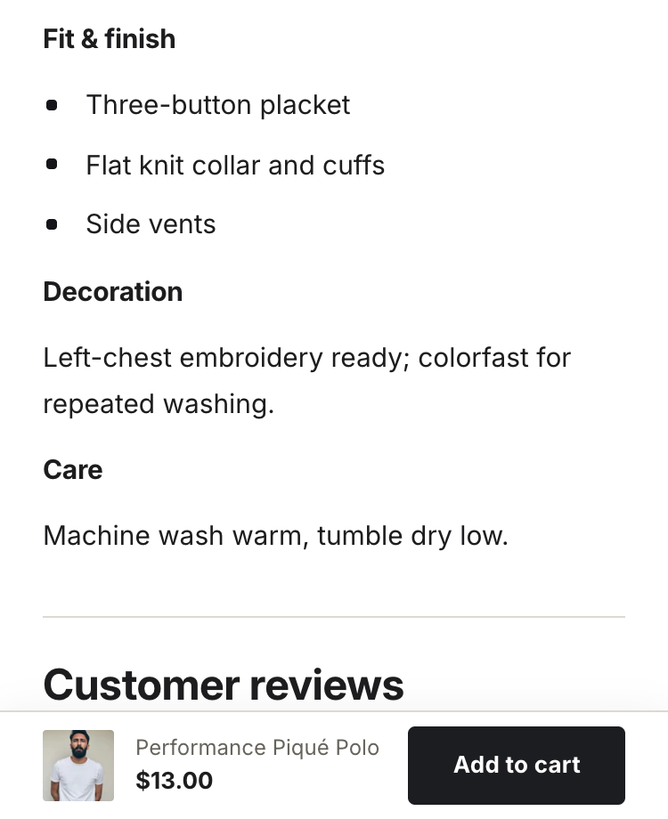
On screens 768px and narrower, a bar docks to the bottom of the screen once the main buy area scrolls out of view. It carries the product thumbnail, title, price, and an add-to-cart button.
For matrix products the bar's button scrolls back up to the matrix, so the order still passes the minimum and increment rules. For picker and single-variant products it submits the buy form directly. The bar never renders on desktop.
The sticky bar on a mobile product page.