
Appearance
Multicolumn
A grid of short columns, each with an image or icon, a heading, copy, and an optional link. Use it for value props, shipping and returns highlights, or a row of category shortcuts.
Add it under Add section → Multicolumn, then add a Column block for each cell. The section takes up to eight.
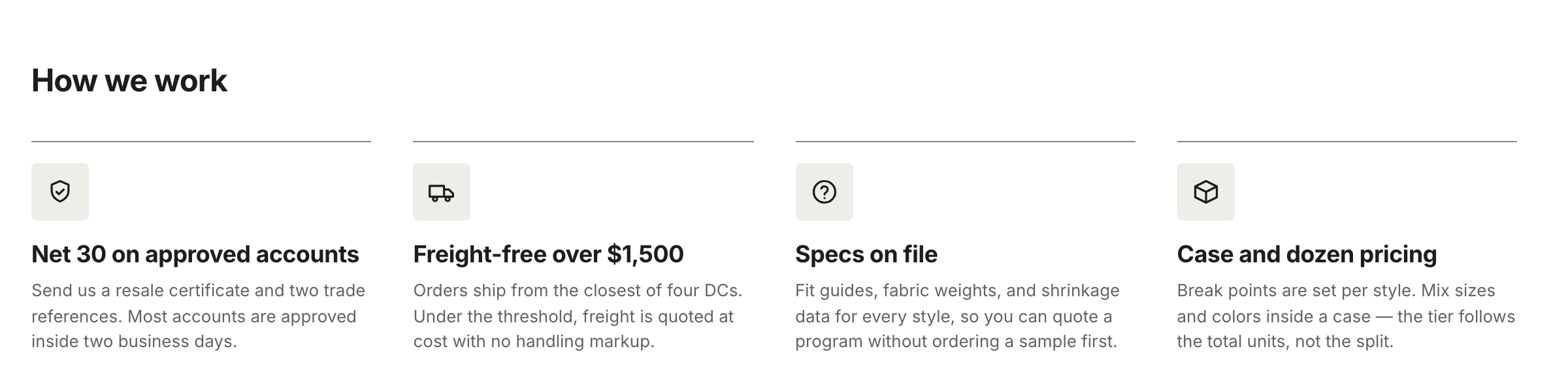
Four Column blocks at four columns, each using an icon rather than an image.
Columns
Each Column block has:
- Image — a small graphic at the top of the column.
- Icon — a built-in line icon: None, Question, Box, Truck, or Shield. It ships as None, and the icon only shows when no image is set.
- Heading and Text — the column's title and rich-text copy.
- Link label and Link URL — an arrow link at the foot of the column. Both are needed for it to show.
Note
An uploaded image always wins over the icon. Pick an icon only for columns with no image.
Layout
Heading at the section level is an optional title above the grid. Columns sets how many columns show on desktop, from 2 to 4. The grid narrows to two columns on medium screens and one on phones — unless Two columns on mobile is on, which keeps two across on phones.
Alignment sets the columns to Left or Center. Color scheme, Top padding, and Bottom padding set the section's background and spacing.