
Appearance
Featured collection
A grid of products from one collection, for surfacing a range on the homepage or a landing page. The cards match the ones on collection pages, so pricing and add behavior carry over.
Add the Featured collection section, set the Heading, and pick a Collection under Content. Set Products to show (2 to 12) and choose Columns — 2, 3, or 4.
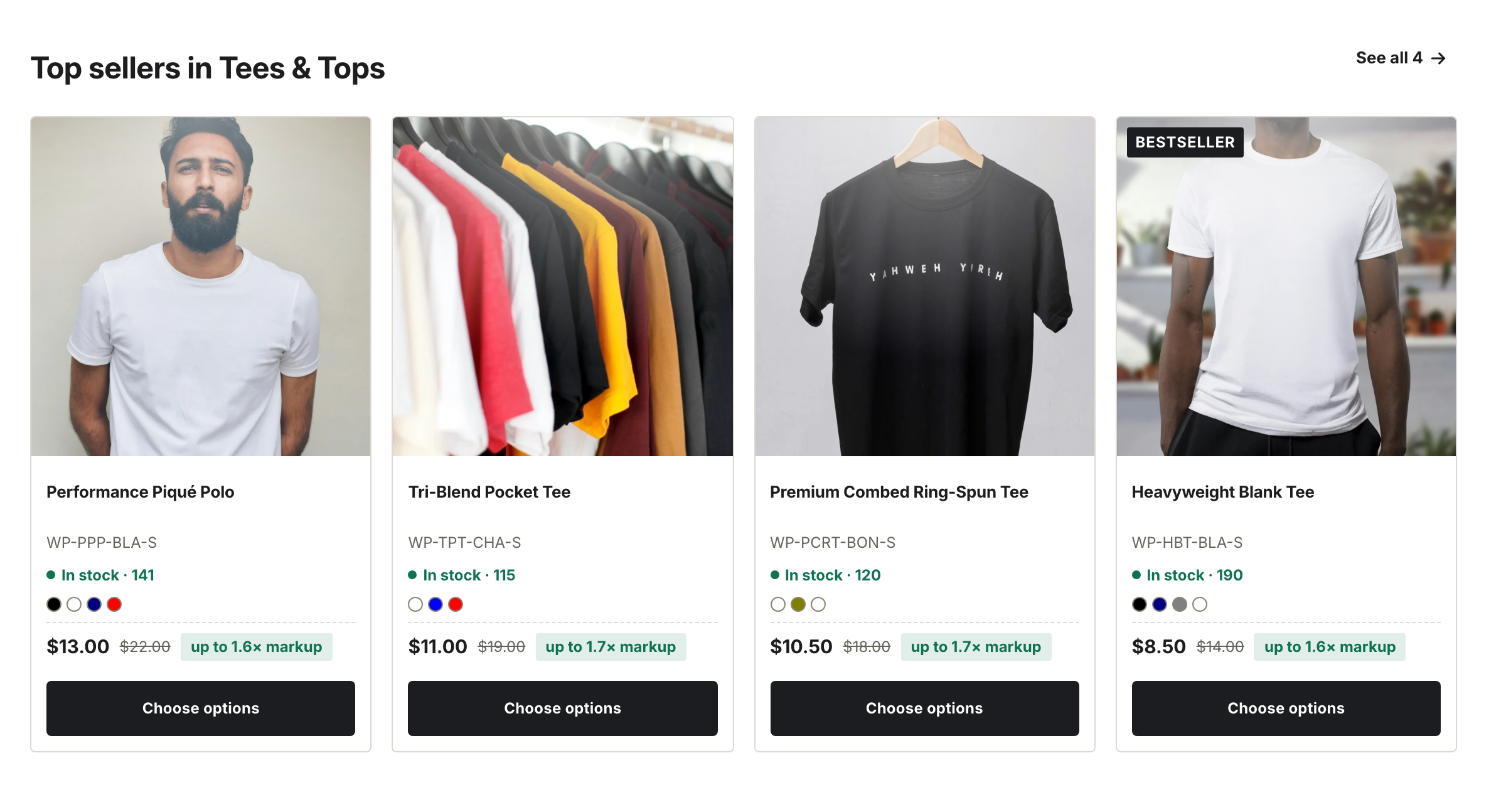
Eight products from one collection, shown at four columns.
Settings
| Setting | What it does |
|---|---|
| Heading | Section title. |
| Collection | The collection to pull products from. |
| Products to show | 2 to 12 products. |
| Columns | 2 columns, 3 columns, or 4 columns. |
| Color scheme | Section background and text colors. |
The card image shape comes from the global Image ratio setting, not this section — see Image ratios and cropping.