
Appearance
Colors
Wonpa has two color layers. Global colors set one palette for the whole storefront. Color schemes re-skin individual sections on top of that palette. Set the globals once during setup; reach for schemes only when a section needs to stand apart.
The two layers
The global colors are the flat swatches under Theme settings → Colors. They define the storefront's palette — background, text, borders, accent, and status colors — and every section inherits them.
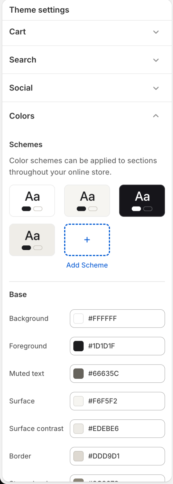
Color schemes sit above the globals. Each scheme stores its own background, text, muted text, border, and accent. A section that offers a Color scheme setting re-skins to the scheme you pick; every other section uses the globals.
The two layers are independent. A scheme holds literal colors of its own, not references to the globals, so editing a global swatch changes nothing in any scheme. Scheme 1 ships with the same values as the shipped globals, which is why a section left on Scheme 1 looks identical to one with no scheme — but that match is a copy, not a link. If you change a global color, change Scheme 1 by hand to match it.
Which sections take a scheme
Color scheme is a per-section setting, and only these sections have it:
Apps, Blog posts, Category tiles, Collapsible content, Collections list, Contact form, Featured collection, Featured product, Image with text, Logo list, Multicolumn, Newsletter, Quote request banner, Rich text, Store info, Testimonials, Trust strip.
In short: the content sections you add to a page yourself, plus the Collections list section on the collections index.
The sections that build your core pages have no Color scheme setting and always render on the globals — Header, Announcement bar, Footer, Hero, Hero dynamic carousel, Product, Product recommendations, Collection, Search results, Page, Article, Blog, Cart, Quick order, Not found, and the customer account sections. To recolor any of those, change the global palette.
Set the global palette
- Open Theme settings → Colors.
- Under Base, set Background, Foreground (body text), Muted text, Surface, Surface contrast, Border, and Strong border.
- Under Accent, set Accent, Accent hover, Accent background, and Dark panels.
- Under Status, set Success, Warning, and Danger.
Accent is the color used for links, primary buttons, and highlights. Dark panels is the near-black fill behind the footer and other inverted areas.
Re-skin one section with a scheme
- In Theme settings → Colors, scroll to the color schemes at the top of the group and edit or add a scheme. Each scheme has five fields: Background, Text, Muted text, and Border under Base, and Accent under Accent.
- In the theme editor, select a section that offers a Color scheme setting — see the list above.
- Set its Color scheme to the scheme you built.
The section's background, text, muted text, border, and accent switch to the scheme. The two accent shades follow along without a field of their own: a scheme whose Accent matches the global Accent inherits the hand-tuned global Accent hover and Accent background, and any other scheme derives them from its own accent instead.
Text sitting on an accent-colored surface — a primary button's label, for instance — is painted with the scheme's Background color, so it tracks whatever you set there. The shipped dark scheme works this way: its background is near-black and its accent is white, so its primary buttons come out as white blocks with near-black labels.
Note
Schemes re-point background, text, muted text, border, and accent, plus the two derived accent shades. Surface, surface contrast, strong border, dark panels, and the status colors stay global, so nested panels keep the storefront palette across every scheme.