
Appearance
Collapsible content
A stack of expandable rows for FAQs, terms, and policy text. Each row is a native accordion — buyers click a heading to reveal its answer, and the page works without JavaScript.
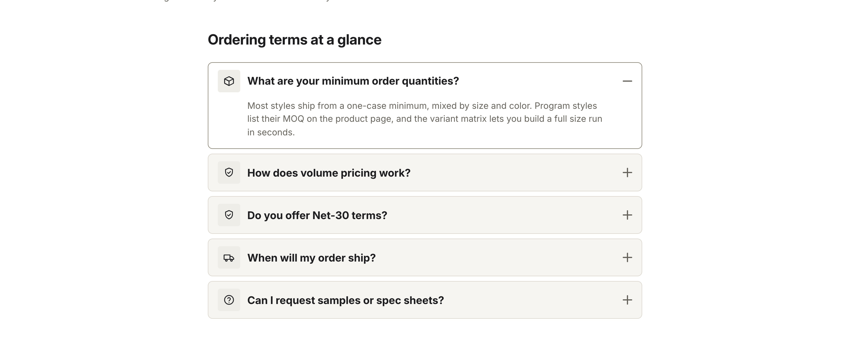
Add the Collapsible content section, then add up to 12 Row blocks. Each row has a Heading, a Text body (rich text), and an optional Icon drawn before the heading — None, Question, Box, Truck, or Shield.
Turn on Open the first row by default to have the top row expanded when the page loads. The rest stay closed until clicked.
Settings
| Setting | What it does |
|---|---|
| Heading | Section title. Leave blank to hide it. |
| Text | Support line under the heading. |
| Width | Full width places the heading in a left column with the rows beside it on desktop. Narrow centers the rows in a reading column. |
| Open the first row by default | Expands the first row on load. |
| Color scheme | Section background and text colors. |
Each Row block carries its own Heading, Text, and Icon.