
Appearance
Header navigation
The header holds your logo, search, account and cart tools, and the primary menu. The menu supports up to three levels: top links, dropdowns, and grandchild entries that fan out into mega-menu columns.
Assign the menu
- In the theme editor, open the Header section.
- Set Menu. It defaults to your store's Main menu.
Build the menu itself in your Shopify admin under Navigation, then pick it here. If the setting is left empty the header falls back to the Main menu.
Logo subtext
Subtext, directly under Menu in the same Content group, prints a second line beneath the store name. It defaults to "B2B wholesale". Clear it to show the store name on its own.
This only appears when no logo image is set under Theme settings → Brand → Logo. With a logo uploaded the header renders the image instead of the store name, so the subtext has nothing to sit under and is not shown.
Dropdowns and mega-menus
A top-level link with nested links becomes a dropdown. How it renders depends on how deep the menu goes.
- A link whose children have no further nesting opens a plain dropdown list.
- A link whose children have their own child links opens a mega-menu. Each child becomes a column. A child that has grandchildren shows its title as a column heading with the grandchildren listed beneath it; a child with no grandchildren sits in its own column as a single link.
One child with grandchildren is enough to switch the whole dropdown to the mega-menu layout.
Both layouts open with a View all link that points to the parent link's own page — the same entry the mobile drawer shows.
Uppercase navigation
Menu labels use your normal capitalization by default. To render them in uppercase, open Theme settings → Typography and turn on Uppercase navigation. It applies to both the desktop menu and the mobile drawer.
Mobile and small-tablet drawer
At 768px and below the desktop menu is replaced by a burger button on the right of the header. It opens a drawer where each top link with children is an accordion row. Opening a row reveals its children, with a View all link at the top that points to the parent link's own page.
All three menu levels appear in the drawer. Grandchild links — the ones that form mega-menu columns on desktop — list indented beneath their parent inside the accordion row.
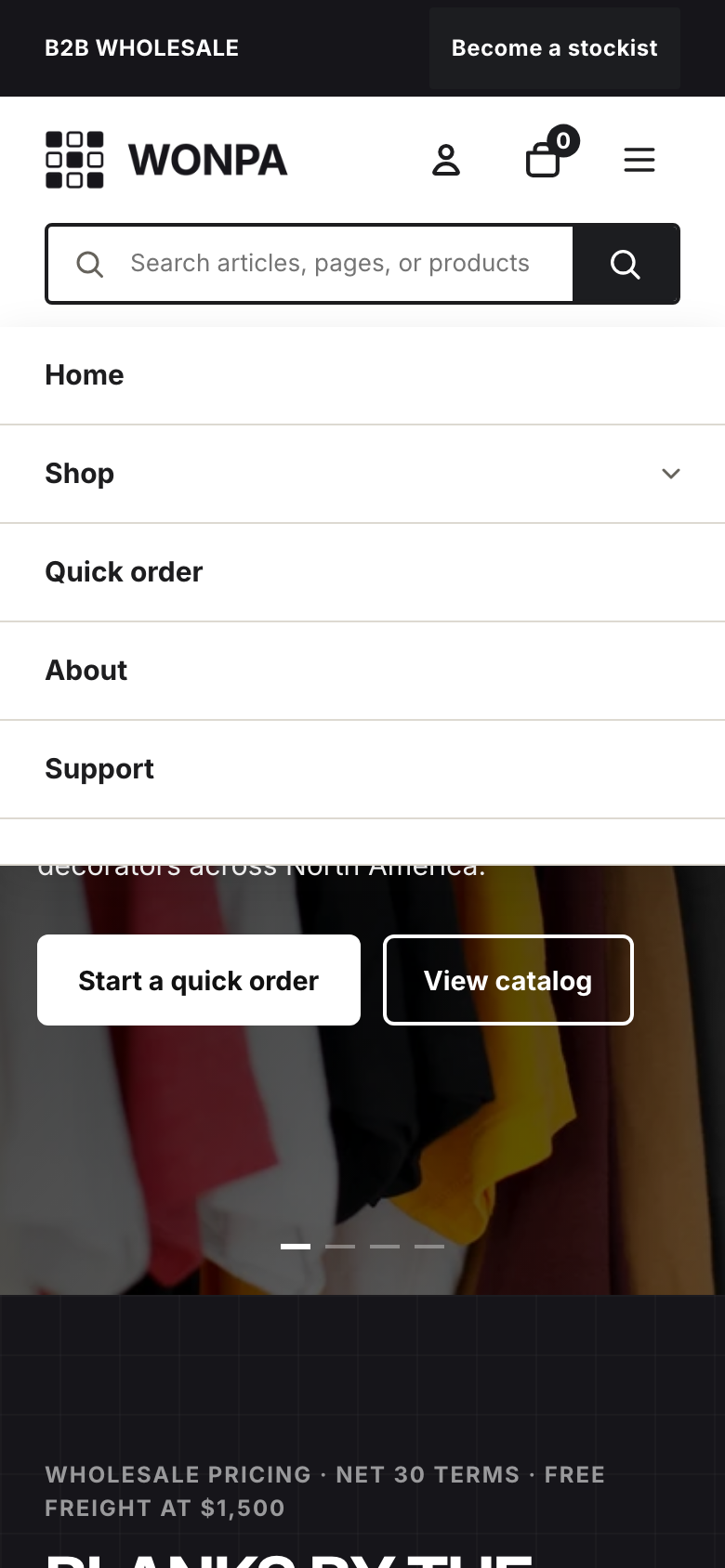
The mobile drawer, opened from the burger button in the header.
Sticky header
The header stays pinned to the top of the window as shoppers scroll. If you use the announcement bar above it, that bar scrolls away while the header remains.